Within the group, it was my responsibility to make the site responsive. Before todays group meeting the site was fixed and when the page size was changed the website stayed the same and required scroll to view the page.
 To make the site responsive the main aspects that needed changing were to width and height, an example of the responsive code as seen in Brackets is displayed above. Changing the width to a percentage rather than a defined pixel meant that the width would change according to size of the browser window. Additionally setting a min-height meant that the div would change size according to the browser size, it also meant that the content would fit the box and not over flow making it appear professional rather than messy and amateur.
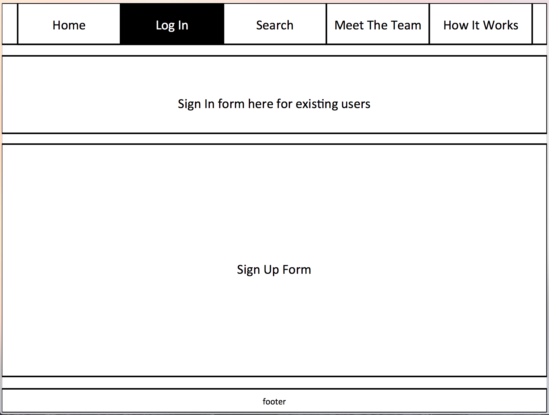
Above is the site in general desktop size of the browser, below is the site sized to its smallest representing a mobile device. A responsive site means that users are able to see the entire page content with ease. Without this they would have to scroll around the page which would cause confusion and mean they loose interest in the site and its content.
 Overall the advantages of using responsive design on the web application are:
- Flexibility
- User Friendly
- Professional Finish
- Easy to Manage


 Luke Pelling