Responsive Site

Within the group, it was my responsibility to make the site responsive. Before todays group meeting the site was fixed and when the page size was changed the website stayed the same and required scroll to view the page.

Screen Shot 20 To make the site responsive the main aspects that needed changing were to width and height, an example of the responsive code as seen in Brackets is displayed above. Changing the width to a percentage rather than a defined pixel meant that the width would change according to size of the browser window. Additionally setting a min-height meant that the div would change size according to the browser size, it also meant that the content would fit the box and not over flow making it appear professional rather than messy and amateur.

respon 
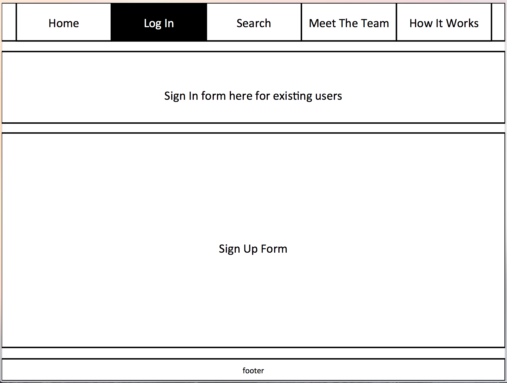
Above is the site in general desktop size of the browser, below is the site sized to its smallest representing a mobile device. A responsive site means that users are able to see the entire page content with ease. Without this they would have to scroll around the page which would cause confusion and mean they loose interest in the site and its content.

responOverall the advantages of using responsive design on the web application are:

  • Flexibility
  • User Friendly
  • Professional Finish
  • Easy to Manage

Date Added

When the results displayed the information that was displayed was:

  • University
  • Description
  • Postcode
  • Bedrooms
  • Rent
  • Contact

When I asked others to use the site feedback I received was that they would like to know when the information was submitted to the site “it would be nice to see when the entry was submitted, that way I would know if it was new meaning I had more of a chance to get the room or to see if the room had been on for a long time it might be vacant now”.

Scdate

After receiving this feedback after agreeing with the group I added the ‘date_added’ field to the results display. This would present the date the entry was submitted onto the site.

Sdat

Net Neutrality

What is Net Neutrality?

Net neutrality describes the idea that Internet service providers and governments should treat all of your Internet traffic, or packets of data the same way, equally.

Importance of Net Neutrality:

The internet and web activity is at the highest it has ever been and displays no signs of falling anytime soon, therefore as so many people are using the web for a variety of reasons e.g. Work, File Transferring or for Social reason there is a need for the net to stay neutral. If the net does not stay neutral it means popular social networking sites such as YouTube will have a charge, this will then limit the users that are able to visit the site. The additional price idea could be set upon many different sites not just social media.

importance

Pros on Net Neutrality:

  • No Throttling: Currently, Internet Service Providers can’t change the download or upload transfer rates depending on what people are accessing.
  • No Restrictions: Currently, there are no restrictions on what parts of the Internet that people can access, except for what local governments decide. For example, there are no restrictions or preferences over emailing, file sharing, instant messaging, blogs, etc.
  • Capitalism: Net Neutrality promotes a level playing field for competing companies, and allows start-ups easier access to new potential customers. Net Neutrality is equated to a free market.
  • No Censorship: There are no restrictions on what or how much anyone can upload or download besides connection rates.

Useful and Insightful Links:

Displaying Results

Once the connection to the database has been made and the forms are all created then next step was for me to use PHP to allow the data in the database to be displayed on the page, which means users would be able view the rooms. This process proved quite difficult for me to complete however with perseverance it was completed.

Below are screen shots of the code that makes the display possible.

Screen Shot 2015-04 Screen Shot 2015-04

The entries into the ‘house’ table of the database are displayed like below on the ‘search’ page of the web application.

Screen Shot22

Filtering

Designing A Filter Form

An important function for users to be able to do is to filter the results. There are over 12 different universities listed on our website therefore users would have to search through all results to find a room relevant to them. This is why the filter form is needed on the site to ensure users can access the vacant rooms with ease allowing the sites purpose to be met.

The first step for allowing this was for me to create a filter form in HTML code. Using the same CSS as the other forms on the site this was made easy, I decided to use the ‘select’ tags which created a drop down menu. This made the form look professional and use a small amount of space yet remain effective.

The result is displayed below:

filterform

Screen Shot 200

PHP Filter Code

Once the form was created PHP code has to be written which would then allow the connection to the database, this would ensure that users were able to filter the results to their needs.

Screen Shot

Templates

Creating Template Files

When creating some aspects of the web application I decided to place curtain features of the page within a template file. This is a great feature to use as it means I only had to change that one file and as the page is connected to all pages on the application they would all change quickly and simply. This is a more effective and time saving method as without this I would have to change the data on each individual page.

Template files I have made:

  • Footer
  • Header

Creating a header template means any changes to the navigation bar, which there has been many to make the bar look more professional and less cluttered have been completed quickly and effectively across the site.

Screen

CSS

When deciding upon the sites colour I had initially designed to the site to follow and white, grey and blue colour scheme, displayed below on the sites ‘How It Works’ page.

Screen Shot 201

I chose the blue as I felt it stuck within the genre of house finder websites as blue was a commonly used colour. Additionally the colour gave the page a professional and formal look.

However, when my group and I met in a group meeting Chloe has designed our logo in the brown colour we had previously discussed. When the logo was put on the site it looked out of place with the colour scheme, this is where collectivly we decided that many to reflect the idea of Southern student we would change the background to green, to reflect the country and nature that the South of England is known for also green was a coloured used largely among existing house finder websites. Additionally we found when doing this the text boxes became more distinct and meant they were more prominent on the page, displaying their importance.

Screen Shot 2015

Database Design

Initial designs:

Before creating the database using phpMyAdmin my group and I created a template, this would ensure the database would have the relevant columns for all the information that would need to be entered. Additionally we needed to establish how many different tables we would need to include.

Screen Shot 20

Database view:

Displayed below is the database as seen in phpMyAdmin, inserting tables into the database was simple to do and means our site can meet the brief; additionally we have entered some information into the tables to test the connection.

Screen Shot 3 Screen Shot 2


Research – Font and Colour

Before deciding on a colour scheme we decided it was best to research into existing estate agent and room finding website. This would provide us an insight into the genre of the web application we will be making and the type of colours and fonts they use throughout their website.

Fonts

As the target audience for many estate websites is mature adults and as the site is a serious topic the fonts on the page are very simple to read. The fonts on all sites I have visited use ‘sans’ fonts.

6a01053618f097970b017c37209230970b

Colours

Blue is the most widely used colour among the websites not only in backgrounds but in font colouring, navigation bars, images and icons.

Commonly used colours:

  • Blue
  • Orange
  • Green
  • Purple

easyroommate Screen Shot 2015-02-26 at 14.37.29 Screen Shot 2015-02-26 at 15.11.54

Site Designs

12

Within the group it was decided that I would create the basic plans for the design of the website. As seen in previous posts I have researched into many existing house finder websites to understand basic layout.

Additionally I have prioritised the content on the page as to what I feel would be most used by users.

123

Including a navigation bar that is located at the top of the page was key. This would allow for easy navigation around the site for all users. As this is a recognised position for this feature among web design it means users already an idea of what the bar will do without having visiting the site before.

Many of the websites I visited within the research used a horizontal design layout. This is where most of the content was posted in different boxes one under the other, in a horizontal way down the page.

1234

Spacing the boxes down the page offers a clear distinction for users when using the site that each section is different. Additionally this will make the site look professional, yet be functional for the users.

12345

Including a ‘How It Works’ page will ensure users are able to use the site to its full potential additionally if they are unsure of the to use the site this is a great go to page to understand. A page like this was found of some of the existing sites I researched.

I have designed the footer to be fixed at the bottom of the window at all time on each page.

123456

The Final Idea

We have decided to design a House Finder website, where users can find housemates and a house to live in where rooms are vacant. We have decided to aim our website at university students in the South of England as we feel like it is not too broad but not too small of an area.

Many of the current websites similar to our idea only include main towns for rooms, where some universities in the South are not in main or busy towns therefore focusing our site on this means they will all be catered for. We will create a database where users will have a username and password, without signing up to the site users will be able to preview content posted to the site however they will not be able to submit to the site without logging in.

Once an account has been created they can then search and filter by universities in the South to find a room that is available, whilst reading information on the housemates and the house.

There will be a tab in the navigation bar that allows users to submit room details, here they will be asked about many different aspects of the room before it is entered into the database.

The search page is where users can then refine a search to rooms and people that are relevant to them. An example of this could be searching for a room where current residents go to Oxford University. Contact will be allowed between email addresses or phone numbers.

I have been designing the layout for the website, initially sketching then moving onto coding using CSS and HTML in Brackets whilst creating the forms along with Terry in PHP code, along with designing the database tables we will need to include.

Chloe have been looking at colours and logos to use for our website, we have all been uploading information about the project to the group wiki.

We will all continue to work as a team, allowing each members input into our work.